Untitled self-indulgent website
Website for George H. Williams
Project maintained by Hosted on GitHub Pages — Theme by mattgraham
Adding local branding to the Koha staff interface
Koha 22.11 brings a whole new look to the Koha staff interface.
The changes mainly involve color choices and the positioning and style of the header search bar. The Koha logo has also moved, and there is a move towards incorporating more icons in the search bar.
Here are some example screenshots from the 22.05 and 22.11 staff interface home pages:
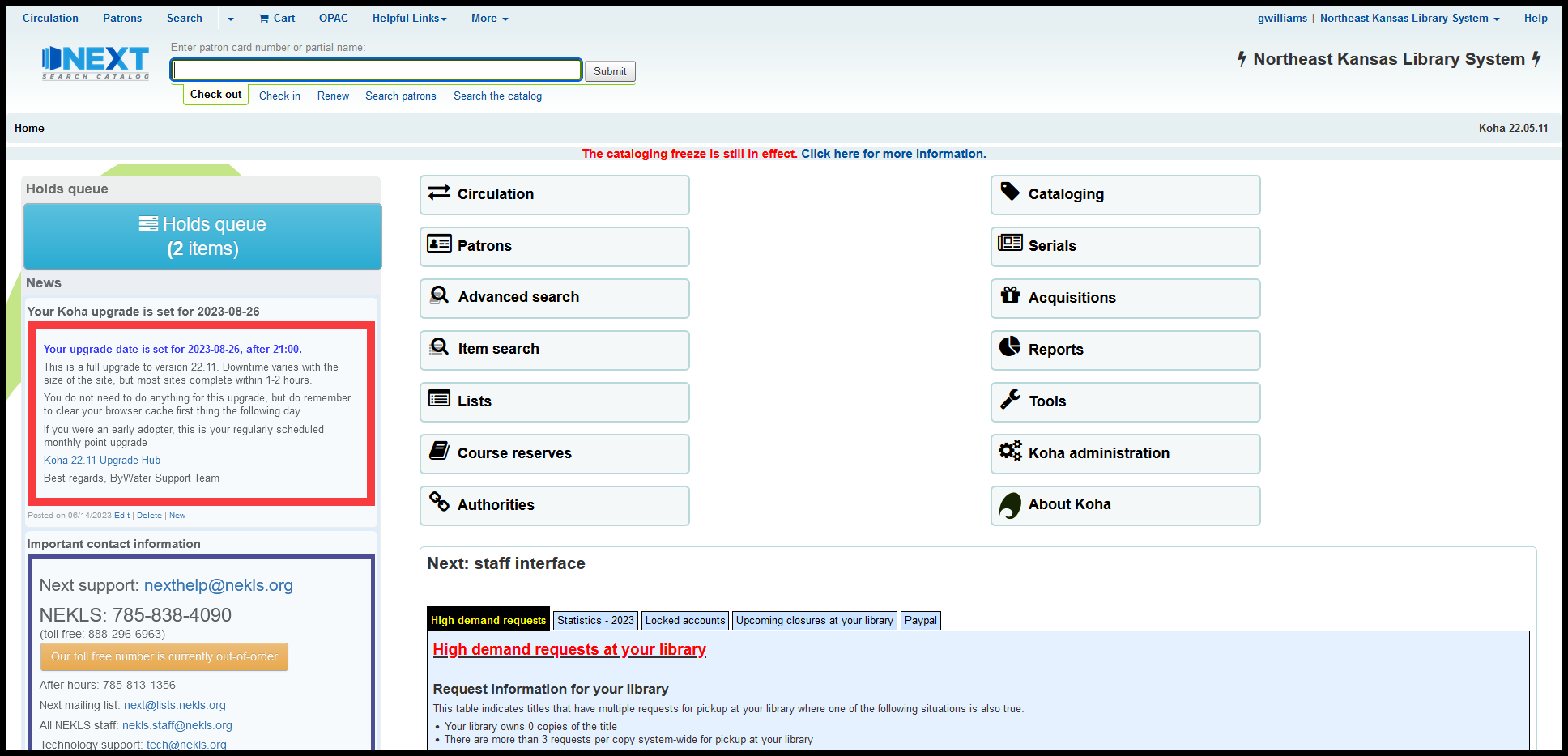
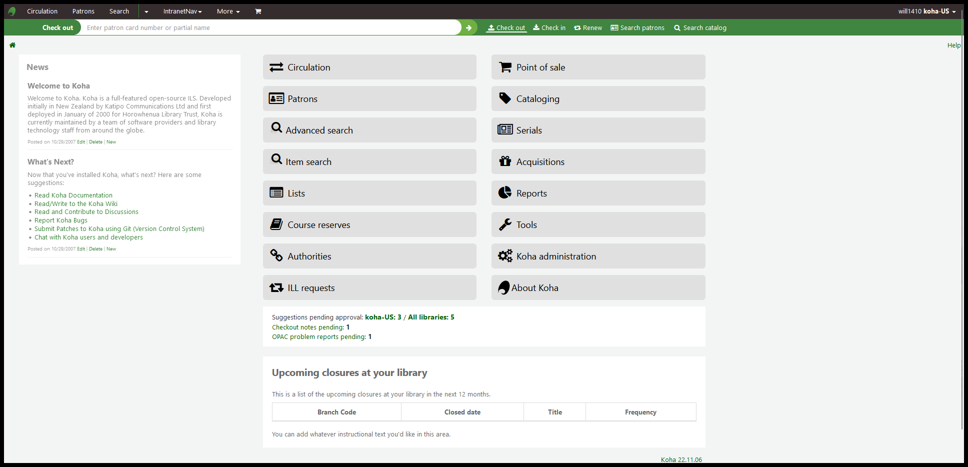
One of the things I’ve always been happy about regarding the older style of Koha’s staff interface is the fact that it was already aligned fairly well with the brand colors that we’ve been using for Next Search Catalog since 2018. Even before that when our consortium was still called “NExpress,” the branding colors in Koha were not too far off from the branding we were using. Light blues with some greens in a few places.
The new colors are firmly in the realm of greens, though, so I wanted to come up with a way of using the “intranetcolorstylesheet,” “intranetstylesheet,” or “IntranetUserCSS” to substitute colors that are part of our logo into the staff interface in Koha. I also wanted to make sure that the colors I chose were accessible to people who might have issues with color blindness. I also took this project as an opportunity to work extensively with a Firefox plugin called “Stylus” for the first time. So, here’s what I did:
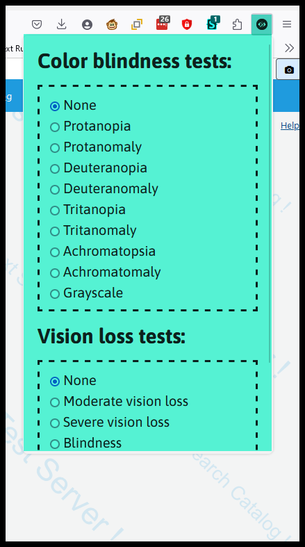
1. Adding A11Y- Color blindness empathy test extension
I almost exclusively use Firefox when I work with Koha. I have Chrome, Opera, and Edge installed on my computer for testing purposes, but I almost always use Firefox.
For Firefox, the color blindness extension I found that I like is A11Y - Color blindness empathy test, so it’s the one I’ve been using. I’ve been told that for Chrome, Colorblindly is the best option. Both are offered under an MIT license.
After the A11Y extension is installed, you can select from the drop-down to see how the changes you are making will look to users with different types of color blindness.
2. Adding Stylus
Stylus is an extension I have used a little bit in the past that allows you to add local CSS to any web site, changing that site’s appearance instantly.
Stylus is released under a Mozilla Public License and can be found at the Stylus extension home page
Like I said, I’ve used it before, but I used it almost exclusively to develop the CSS for this project.
3. Developing the color pallette
I made use of Venngage’s Accessible color palette generator to generate the colors I wanted to use.
I knew starting off that our logo’s main color is #1f9bde and that it has a dark accent, #0157b9. I started building my color palette by deciding I wanted three basic colors: light, medium, and dark and I decided that I’d use CSS variables to make changing the palette simpler if it became necessary.
The first thing I did was go to the accessible color palette generator and generate contrasting monochromatic colors for #1f9bde and for #0157b9. Then I decided to use the lightest color palette match for #1f9bde as my light color.
My basic color variables became:
| Color | variable name | Color ID |
|---|---|---|
| dark color | --c_dark |
#0157b9 |
| medium color | --c_medium |
#1f9bde |
| light color | --c_light |
#d7ebff |
Then I added a the contrasting text color for each selection to my set of variables:
| Color | variable name | Color ID |
|---|---|---|
| dark color | --c_dark |
#0157b9 |
| dark text | --t_dark |
#FFFFFF |
| medium color | --c_medium |
#1f9bde |
| medium text | --t_medium |
#FFFFFF |
| light color | --c_light |
#d7ebff |
| light text | --t_light |
#000000 |
Then I wanted to add variables for contrasting colors when elements were hovered over. I simplified this by deciding that when the light elements were hovered over, they’d toggle to the medium colors and the medium colors would toggle to dark on hover. To create colors for the dark hover, I went back to the accessible color palette generator and picked the darkest monochromatic color that matched with #0157b9.
This gave me:
| Color | variable name | Color ID |
|---|---|---|
| dark color | --c_dark |
#0157b9 |
| dark text | --t_dark |
#FFFFFF |
| dark hover color | --c_dark |
#04368e |
| dark hover text | --t_dark |
#FFFFFF |
| medium color | --c_medium |
#1f9bde |
| medium text | --t_medium |
#FFFFFF |
| medium hover color | --c_medium |
#0157b9 |
| medium hover text | --t_medium |
#FFFFFF |
| light color | --c_light |
#d7ebff |
| light text | --t_light |
#000000 |
| light hover color | --c_light |
#1f9bde |
| light hover text | --t_light |
#FFFFFF |
Next I decided that I wanted the overall text color on all pages to be darker and I wanted to change the green color of all of the links.
This lead to:
| Color | variable name | Color ID |
|---|---|---|
| dark color | --c_dark |
#0157b9 |
| dark text | --t_dark |
#FFFFFF |
| dark hover color | --c_dark_hov |
#04368e |
| dark hover text | --t_dark_hov |
#FFFFFF |
| medium color | --c_medium |
#1f9bde |
| medium text | --t_medium |
#FFFFFF |
| medium hover color | --c_medium_hov |
#0157b9 |
| medium hover text | --t_medium_hov |
#FFFFFF |
| light color | --c_light |
#d7ebff |
| light text | --t_light |
#000000 |
| light hover color | --c_light_hov |
#1f9bde |
| light hover text | --t_light_hov |
#FFFFFF |
| general text color | --general_text |
#000000 |
| general link color | --general_link |
#04368e |
Then I wanted to change the header from white on black to black on white. If I was going to work on a re-theme for Koha that worked as a “Dark” mode, I’d want the header to be white on black. With our existing colors, though, I found the white on black to be a little oppressive, so I came up with some colors for the header:
| Color | variable name | Color ID |
|---|---|---|
| dark color | --c_dark |
#0157b9 |
| dark text | --t_dark |
#FFFFFF |
| dark hover color | --c_dark_hov |
#04368e |
| dark hover text | --t_dark_hov |
#FFFFFF |
| medium color | --c_medium |
#1f9bde |
| medium text | --t_medium |
#FFFFFF |
| medium hover color | --c_medium_hov |
#0157b9 |
| medium hover text | --t_medium_hov |
#FFFFFF |
| light color | --c_light |
#d7ebff |
| light text | --t_light |
#000000 |
| light hover color | --c_light_hov |
#1f9bde |
| light hover text | --t_light_hov |
#FFFFFF |
| general text color | --general_text |
#000000 |
| general link color | --general_link |
#04368e |
| header color | --c_head |
#FFFFFF |
| header text | --t_head |
#000000 |
| header hover color | --c_head_hov |
#e0e0e0 |
| header hover text | --t_head_hov |
#000000 |
Finally, to help me with testing, I added two more variables to help with testing:
| Color | variable name | Color ID |
|---|---|---|
| dark color | --c_dark |
#0157b9 |
| dark text | --t_dark |
#FFFFFF |
| dark hover color | --c_dark_hov |
#04368e |
| dark hover text | --t_dark_hov |
#FFFFFF |
| medium color | --c_medium |
#1f9bde |
| medium text | --t_medium |
#FFFFFF |
| medium hover color | --c_medium_hov |
#0157b9 |
| medium hover text | --t_medium_hov |
#FFFFFF |
| light color | --c_light |
#d7ebff |
| light text | --t_light |
#000000 |
| light hover color | --c_light_hov |
#1f9bde |
| light hover text | --t_light_hov |
#FFFFFF |
| general text color | --general_text |
#000000 |
| general link color | --general_link |
#04368e |
| header color | --c_head |
#FFFFFF |
| header text | --t_head |
#000000 |
| header hover color | --c_head_hov |
#e0e0e0 |
| header hover text | --t_head_hov |
#000000 |
| test color | --testt |
black |
| test text | --testc |
red |
4. The CSS
The CSS I wrote for this project is the first time that I’ve really extensively used CSS variables. This simplifies the modifications because, instead of having to remember a dozen hexidecimal color codes, I just had to remember whether this is something I want light, medium, or dark, whether it’s something that changes on hover, and whether it’s in the background or a piece of text. And if I am having troulbe finding the right selector, I can use var(--testt) or var(--testc) to manipulate things on the page until I find the selector that works the way I want it to.
To use the colors I selected, the first part of the CSS is a “root” statement that declares the variables that are available for all pages
  /* root section sets Brand colors */

  :root {

    /* Dark */
    --c_dark: #0157b9;
    --t_dark: #FFFFFF;

    --c_dark_hov: #04368e;
    --t_dark_hov: #FFFFFF;

    /* Medium */
    --c_medium: #1f9bde;
    --t_medium: #FFFFFF;

    --c_medium_hov: #0157b9;
    --t_medium_hov: #FFFFFF;

    /* Light */
    --c_light_hov: #1f9bde;
    --t_light_hov: #FFFFFF;

    --c_light: #d7ebff;
    --t_light: #000000;


    /* Colors for header */
    --c_head: #FFFFFF;
    --t_head: #000000;

    --c_head_hov: #e0e0e0;
    --t_head_hov: #000000;

    /* Text colors */

    --general_text: #000000;
    --general_link: #04368e;

    /* test colors */
    --testt: red;
    --textcolor: black;

  }
Once those variables are set, anytime I want to change a color in Koha to the medium color, instead of using “#1f9bde”, all I have to do is insert var(--c_medium).
The big advantage of this is that if I decide I want to use a different color as my medium color, I can change the variable, and all of the CSS that uses var(--c_medium) will be changed and I won’t have to dig through the CSS and change every instance of “#1f9bde”.
5. The (more-or-less) complete CSS
I’m calling this “more-or-less” complete because I am currently only running this code on my test server. I’m the only one who has been using it, so there may be places in Koha where the colors are still the Koha 22.11 default colors and I just haven’t found them yet. For as far as it’s been tested, though, this appears to work quite well.
I have tried to use CSS comments to indicate what each piece of this code does in Koha.
- Updated for Koha 25.05
/* -- BEGIN Re-brand the Koha staff interface - Updated for Koha 25.05 -- */

/* Set colors for re-branding */
  :root {

    /* Dark */
      --c_dark: #0157b9;
      --t_dark: #FFFFFF;

      --c_dark_hov: #04368e;
      --t_dark_hov: #FFFFFF;

    /* Medium */
      --c_medium: #1f9bde;
      --t_medium: #FFFFFF;

      --c_medium_hov: #0157b9;
      --t_medium_hov: #FFFFFF;

    /* Light */
      --c_light: #d7ebff;
      --t_light: #000000;

      --c_light_hov: #1f9bde;
      --t_light_hov: #FFFFFF;

    /* Colors for header */
      --c_head: #FFFFFF;
      --t_head: #000000;

      --c_head_hov: #e0e0e0;
      --t_head_hov: #000000;

    /* Text colors */
      --general_text: #000000;
      --general_link: #04368e;

  }

/* All pages - highlighting */
  ::-moz-selection,  ::selection {
    background: var(--c_medium);
    color: var(--t_medium);
  }

/* -- All pages - header -- */

  /* Styles the header */
    .navbar,
    #header li a {
      background-color: var(--c_head) !important;
      border: var(--c_head) !important;
      color: var(--t_head) !important;
    }

  /* Styles header options on hover and focus */
    #header #toplevelmenu > li:nth-child(n):nth-child(-n+3):nth-child(-n+2) a:hover,
    #header #toplevelmenu > li:nth-child(n):nth-child(-n+3):nth-child(-n+2) a:focus,
    #header #toplevelmenu > li:nth-child(n):nth-child(n+5) a:hover,
    #header #toplevelmenu > li:nth-child(n):nth-child(n+5) a:focus,
    #header #logged-in-menu:hover,
    #header #logged-in-menu:focus,
    #header .dropdown-menu li a:hover,
    #header .dropdown-menu li a:focus {
      background-color: var(--c_head_hov) !important;
      color: var(--t_head_hov) !important;
      border-radius: 16px;
    }

  /* Styles "Search" option and adjacent dropdown as one */
  /* Removes black line separator between "Search" and caret */
    #header #catalog-search-link #catalog-search-dropdown,
    #header #catalog-search-link,
    #header #catalog-search-link .dropdown-toggle {
      border: 0px;
    }

  /* Styles the "Search" link */
    #header #catalog-search-link *:hover,
    #header #catalog-search-link *:focus {
      background-color: var(--c_head_hov) !important;
      color: var(--t_head_hov) !important;
      border-top-left-radius: 16px;
      border-bottom-left-radius: 16px;
      border-right: 0px;
    }

  /* Styles the down-caret link on hover over the "Search" link */
    #header #catalog-search-dropdown>a.catalog-search-dropdown-hover,
    #header #catalog-search-dropdown>a.catalog-search-dropdown-hover:focus {
      background-color: var(--c_head_hov) !important;
      border-top-right-radius: 16px;
      border-bottom-right-radius: 16px;
      border-left: 0px;
    }

  /* Styles the search down-caret on hover  */
    #header #catalog-search-dropdown>a:hover,
    #header #catalog-search-dropdown>a:focus {
      background-color: var(--c_head_hov) !important;
      border-top-right-radius: 16px;
      border-bottom-right-radius: 16px;
    }

  /* Styles dropdown menus in header on hover */
    #header .dropdown-menu a:hover,
    #header .dropdown-menu a:focus {
      border-radius: 0px !important;
      border: 0px;
    }

/* --- All pages - Search bar changes --- */

  /* Highlights input box in black on focus */
    #header_search .form-content:focus-within {
      box-shadow: inset 0px 0px 0px 4px #000000;
    }

  /* Adds padding to search bar to embiggen */
    #header_search {
      padding: .75em;
    }

  /* Styles search bar title area */
    #header_search .form-title {
      background-color: var(--c_dark);
      color: var(--t_dark);
      padding: 5px 16px 5px 16px;
      border-top-left-radius: 16px;
      border-bottom-left-radius: 16px;
    }

  /* Styles search bar title */
    #header_search .form-title label {
      background-color: var(--c_dark);
      color: var(--t_dark);
      margin: 0 auto;
    }

  /* Styles header search area */
    #header_search {
      border: 1px solid var(--c_medium);
      background-color: var(--c_medium);
      color: var(--t_medium);
    }

  /* Styles header search area buttons */
    #header_search ul {
      background-color: var(--c_medium);
      color: var(--t_medium);
    }

  /* Styles search type buttons */
    #header_search .nav-tabs>li>a {
      background-color: var(--c_medium);
      border: 1px solid var(--c_medium) !important;
      color: var(--t_medium);
      text-decoration: none;
      border-radius: 16px;
      padding: 0.5em .8em !important;
    }

  /* Styles search type buttons on hover or focus */
    #header_search .nav-tabs>li>a:hover,
    #header_search .nav-tabs>li>a:focus,
    #header_search a.nav-link.active {
      background-color: var(--c_medium_hov);
      border: 1px solid var(--c_medium_hov) !important;
      color: var(--t_medium_hov) !important;
        text-decoration: none;
      border-radius: 16px;
      padding: 0.5em .8em;
    }

  /* Styles the submit button */
    #header_search button {
      background-color: var(--c_light) !important;
      color: var(--t_light) !important;
    }

  /* Styles the submit button on hover */
    #header_search button:hover {
      background-color: var(--c_dark_hov) !important;
      color: var(--t_dark_hov) !important;
    }

  /* Styles the filter icon on hover */
    div#header_search div.tab-content button.form-extra-content-toggle {
      background-color: transparent !important;
      color: black !important;
    }

  /* Styles drop-down list on search catalog */
    #header_search .form-extra-content #idx {
      color: black !important
    }

/* -- All pages - general stuff -- */

  /* Styles all default text in "--general_text" color */
    h1,
    h2,
    h3,
    h4,
    h5,
    h6,
    p,
    h1:hover,
    h2:hover,
    h3:hover,
    h4:hover,
    h5:hover,
    h6:hover,
    p:hover,
    a:hover,
    h1:focus,
    h2:focus,
    h3:focus,
    h4:focus,
    h5:focus,
    h6:focus,
    p:focus,
    a:focus {
      color: var(--general_text) !important;
    }

  /* Styles all links in "--general_link" + underlines all links */
    a {
      color: var(--general_link);
      text-decoration: underline;
    }

  /* Styles links on hover */
    a:hover,
    a:focus {
      color: var(--t_light);
      background-color: var(--c_light);
      text-decoration: none;
    }

  /* Excludes logo and "Home" icon from link styles */
    #logo,
    #breadcrumbs ol li:nth-child(1) a,
    #breadcrumbs ol li:nth-child(1) a:hover {
      background-color: transparent;
      color: var(--general_link) !important;
      text-decoration: none;
      border: 0px;
    }

/* -- Things that affect multiple pages -- */
/* (/cgi-bin/koha/virtualshelves/shelves.pl), (/cgi-bin/koha/authorities/authorities.pl?authid=n), (/cgi-bin/koha/cataloguing/addbiblio.pl?biblionumber=n) */

  /* -- Tabs on tables -- */
    /* Style table tabs */
      .nav-tabs .nav-link {
        background-color: var(--c_light) !important;
        color: var(--t_light) !important;
        border: 2px solid var(--c_light) !important;
      }
    /* Style table tabs on hover */
      .nav-tabs .nav-link:hover {
        background-color: var(--c_light_hov) !important;
        color: var(--t_light_hov) !important;
        border: 2px solid var(--c_light_hov) !important;
      }
    /* Style active table tab */
      .nav-tabs .nav-link.active,
      .nav-tabs .nav-link.active:focus {
        background-color: var(--c_dark) !important;
        color: var(--t_dark) !important;
        border: 1px solid black !important;
        border-bottom: 0px;
      }

/* -- Pages with sub-module bottons (circ/circulation-home.pl) (cataloguing/cataloging-home.pl) -- */
  /* Style sub-module buttons */
    .buttons-list li a:hover,
    .buttons-list li a:focus {
      background-color: var(--c_light_hov) !important;
      color: var(--t_light_hov) !important;
    }

/* Home page (koha/mainpage.pl) */
  /* Home page - make module buttons Medium color on hover */
    ul.biglinks-list li a.icon_general:hover,
    ul.biglinks-list li a.icon_general:focus {
      background-color: var(--c_light_hov) !important;
      color: var(--t_light_hov) !important;
    }

/* -- Pages with left side menu -- */
  /* Home Administration * --- */
  /* Home  > Acquisitions * --- */
  /* Home Circulation  > * --- */
  /* Home Reports Guided reports * --- */
  /* Home  > Serials --- */
  /* Home Tools  > * --- */

  /* Styles title and heading left menu */
    .sidebar_menu h5 {
      color: var(--general_text);
    }
  /* Styles dormant links in left menu */
    .sidebar_menu ul li a {
      color: var(--general_link);
    }
  /* Styles currently selected left menu link */
    .sidebar_menu ul li.active>a,
    .sidebar_menu ul li a.current {
      color: var(--general_link);
      border-left: solid 15px var(--c_medium);
    }
  /* Styles left menu links on hover */
    .sidebar_menu ul li a:hover,
    .sidebar_menu ul li a:focus,
    .sidebar_menu ul li.active .pref_sublink:hover,
    .sidebar_menu ul li.active .pref_sublink:focus {
      border-left: solid 20px var(--c_dark_hov) !important;
      background-color: var(--c_light);
      color: var(--t_light);
      font-weight: bold !important;
    }
  /* Styles sub-menu links on left menu */
  /* This seems to only be on (admin/preferences.pl) */
    .sidebar_menu ul li.active .pref_sublink {
      color: var(--general_link);
      border-left: solid 10px var(--c_medium);
    }

/* -- Pages with flatpickr */
  /* Style links in flatpickr */
    .shortcut-buttons-flatpickr-button {
      color: var(--c_dark) !important;
    }
  /* Style flatpickr border */
    .flatpickr-calendar {
      border: 1px solid var(--c_dark);
    }

/* -- Pages with datatables -- */
/* --- /cgi-bin/koha/virtualshelves/shelves.pl for example --- */
  /* Styles "Processing" pop-up message */
    /* Colors the border */
      .dt-processing {
        border: 2px solid var(--c_medium) !important;
      }
    /* Colors the revolving dots */
      .dt-processing div * {
        background: var(--c_medium) !important;
      }

  /* Styles pagination controls for datatables*/
    /* Styles active links and numbers */
      .dt-paging .dt-paging-button {
        color: var(--general_link) !important;
      }
    /* Styles links and numbers on hover */
      .dt-paging .dt-paging-button:not(.disabled):not(.current):hover {
        background-color: var(--c_light_hov) !important;
        color: var(--t_light_hov) !important;
        border-radius: 6px !important;
      }
    /* Styles disabled links and numbers on hover */
      .dt-paging .dt-paging-button.disabled:hover,
      .dt-paging .dt-paging-button.current:hover {
        text-decoration: none !important;
      }
    /* Styles background color on currently selected number  */
      .dt-paging .dt-paging-button.current {
        background: var(--c_light) !important;
        border-radius: 6px !important;
      }

  /* Style number box (members/members-home.pl) */
    /* Styles modification count */
      .pending-info span,
      .pending-info span * {
        background-color: var(--c_light) !important;
        color: var(--t_light) !important;
        text-decoration: none !important;
      }
    /* Styles modification count on hover */
      .pending-info span:hover,
      .pending-info span:hover * {
        background-color: var(--c_light_hov) !important;
        color: var(--t_light_hov) !important;
        text-decoration: none !important;
      }

  /* Style link buttons in link text */
    /* Select all and clear all buttons on (members/members-home.pl) */
    /* Options buttons on (catalogue/search.pl) */
      .btn.btn-link,
      #searchheader a {
        color: var(--general_link);
      }

  /* Style block pagination (authorities/authorities-home.pl?op=do_search . . . ) */
    /* Style page numbers */
      div.pages a:link,
      div.pages a:visited {
        background-color: var(--c_light);
        color: var(--t_light);
      }
    /* Style page numbers on hover */
      div.pages a:hover,
      div.pages a:active {
        background-color: var(--c_light_hov);
        color: var(--t_light_hov)
      }
    /* Style current page number */
      div.pages .current,
      div.pages .currentPage {
        background-color: var(--c_dark);
        color: var(--t_dark);
      }

/* Check out (circ/circulation.pl?borrowernumber=) */
  /* Style claims returned badges */
    #return-claims-count-resolved,
    #return-claims-count-unresolved {
      background-color: var(--c_light) !important;
      color: var(--t_light) !important;
      line-height: 1;
      font-size: 100%;
      font-weight: bold;
      border: 1px black solid;
    }

/* Authorities detail for . . . (authorities/detail.pl?authid=n) */
  /* Style tag number  */
    #authoritiestabs .tag_num {
      color: var(--general_text);
    }
  /* Style authority link spyglass (catalogue/detail.pl?biblionumber=n) */
    .authlink {
      background-color: var(--c_light) !important;
    }
  /* Styles "Clear search form" on Z39.50 search (cataloguing/z3950_auth_search.pl) */
    #resetZ3950Search {
      color: var(--general_link);
    }

  /* Patron lists */
  /* Also affects (tags/review.pl?approved=) - added "Select all pending" */
  /* Also affects (z3950_auth_search.pl) */
    /* Style "Select all" and "Clear all" buttons on Patron lists > NAME > Add patrons (patron_lists/list.pl?patron_list_id=n) */
      #CheckAll,
      #CheckNone,
      #CheckPending {
        color: var(--general_link);
      }

/* Check-in modal (circ/returns.pl) */
  /* Styles modal header and footer */
  .modal-header,
  .modal-footer {
    background-color: var(--c_light);
    border-bottom: 1px solid var(--c_light_hov);
    border-top: 1px solid var(--clight_hov)
  }

/* Advanced catalog editor (cataloguing/editor.pl#catalog/n) */
  /* Style text */
    #cat_addbiblio .CodeMirror-code * {
      color: var(--general_link);
    }
  /* Style dropdown borders */
    .CodeMirror-widget .subfield-widget {
      border: solid 2px var(--general_link) !important;
    }
  /* Style select outline */
    .CodeMirror-widget .subfield-widget select:focus {
      outline: 0px var(--general_link) solid !important;
    }
  /* Style the status bar underneath the advanced editor window */
    #statusbar {
      border: solid 2px var(--general_link);
    }
  /* Style the advanced editor slider */
    #toggle-editor .switch input:checked+.slider {
      background-color: var(--c_medium);
    }

/* Catalog search results  */
  /* Style search facets heading */
    #search-facets h4 {
      background-color: var(--c_medium);
      color: var(--t_medium);
    }
  /* Style "Hightlight"/"Unhighlight" */
    .highlight_toggle {
      color: var(--general_link) !important;
    }
  /* Style "Hightlight"/"Unhighlight" on hover */
    .highlight_toggle:hover {
      background-color: var(--c_light);
      color: var(-t_light) !important;
      border-radius: 6px;
    }

/* Search results (catalogue/search.pl?q=x) */
  /* Style page numbers */
    .pagination>li>a,
    .pagination>li>span {
      color: var(--t_light);
      background-color: var(--c_light);
    }
  /* Style page numbers on hover */
    .pagination>li>a:hover,
    .pagination>li>span:hover,
    .pagination>li>a:focus,
    .pagination>li>span:focus {
      color: var(--t_light_hov);
      background-color: var(--c_light_hov);
    }
  /* Style selected page number */
    .pagination>.active>a,
    .pagination>.active>span,
    .pagination>.active>a:hover,
    .pagination>.active>span:hover,
    .pagination>.active>a:focus,
    .pagination>.active>span:focus {
      color: var(--t_dark);
      background-color: var(--c_dark);
      border-color: var(--c_dark);
    }

/* Home > Catalog > TITLE > Details */
/* (/cgi-bin/koha/catalogue/detail.pl?biblionumber=[BIBLIONUMBER]) */
  /* Browse results border */
    #browse-return-to-results {
      border: 1px solid var(--c_medium);
    }
  /* Browse results button border */
    .browse-button {
      background-color: rgba(0, 0, 0, 0);
      border: 1px solid var(--c_medium);
    }
  /* Browse results buttons */
    a.browse-button,
    span.browse-button {
      color: var(--c_medium);
    }

  /* Styles dropdown lists in link text */
    #toolbar ul li a {
      color: var(--general_link);
    }

  /* Styles dropdown lists when active */
    #toolbar ul li a:active {
      background-color: var(--c_light_hov);
      color: var(--t_light_hov);
    }

/* Home > Administration */
/* (/cgi-bin/koha/admin/admin-home.pl) */
  /* Styles message modal after saving prefrences */
    .humanMsg p,
    #humanMsgLog .launcher {
      color: var(--t_medium) !important;
    }

/* Multiple pages including /cgi-bin/koha/catalogue/search.pl, /cgi-bin/koha/members/members-home.pl */
  /* Styles border color of input and text area boxes when focused */
    input:focus,
    textarea:focus {
      border-color: var(--c_medium);
    }

/* Home > Circulation > Checkouts > NAME (CARDNUMBER)*/
/* (/cgi-bin/koha/circ/circulation.pl?borrowernumber=[BORROWERNUMBER]) */
  /* Style "Checked out" message */
    div.lastchecked {
      border: 2px solid var(--c_medium);
    }
  /* Style "Approve" checkmark icon wherever it appears */
    .approve i.fa,
    .success i.fa {
      color: var(--c_dark);
    }

/* Home > Patrons > NAME (CARDNUMBER) > Make a payment > Pay an individual charge */
/* (/cgi-bin/koha/members/paycollect.pl?borrowernumber=[BORROWERNUMBER]. . . ) */
  /* Colors text of "Pay" and "Write off buttons" */
    .nav-pills a {
      color: var(--general_text);
    }
  /* Style buttons when paying fee (members/paycollect.pl) */
    .nav-pills .nav-link.active,
    .nav-pills .show>.nav-link {
      color: var(--t_medium);
      background-color: var(--c_medium);
    }
  /* Style buttons when paying fee on hover */
    .nav-pills .nav-link.active:hover,
    .nav-pills .show>.nav-link:focus {
      color: var(--t_medium_hov) !important;
      background-color: var(--c_medium_hov);
    }

/* Home > About Koha (/cgi-bin/koha/about.pl) */
  /* Super minor change - changes bootstrap blue "success" highlight to branded light color */
    .text-bg-info {
      background-color: var(--c_light) !important;
      color: var(--t_light) !important;
    }


/* Panels - various pages */
/* Home > Administration > Table settings (/cgi-bin/koha/admin/columns_settings.pl) */
/* Home > Patrons > Update patron records (/cgi-bin/koha/members/members-update.pl) */
/* Home > Tools > BRANCHNAME calendar (/cgi-bin/koha/tools/holidays.pl) */
  /* Style the panel border */
    .panel {
      border: 1px solid var(--c_dark);
      background: hsl(from var(--c_light) h s calc(l + )) none;
    }
  /* Styles panel title on focus  */
    .panel-title a:focus-within {
      background-color: inherit;
      border-radius: 0px ;
    }
  /* Styles panel on hover */
    .panel:hover,
    .panel .panel-heading a:hover,
    .panel:focus-within,
    .panel .panel-heading a:focus-within {
      background: var(--c_light) none
    }

/* Home > Administration > Did you mean? (/cgi-bin/koha/admin/didyoumean.pl) */
  /* Styles plugin titles */
    .pluginname {
      background-color: var(--c_light);
    }

/* Home > Plugins > ALL_PLUGINS (/cgi-bin/koha/plugins/. . . ) */
  /* Styles the un-styled part of the breadcrumbs on the plugins pages*/
    #breadcrumbs a[href="/cgi-bin/koha/mainpage.pl"] {
      color: var(--c_medium_hov);
    }

/* Pages with toolbars */
/* (members/moremember.pl) (cataloguing/cataloging-home.pl) (labels/label-home.pl) (tools/automatic_item_modification_by_age.pl) (tools/automatic_item_modification_by_age.pl?op=edit_form) */
  /* Style toolbar buttons */
    #toolbar .btn.btn-default,
    .btn-toolbar .btn.btn-default {
      color: var(--general_link);
      padding: 6px 12px;
      border: 1px dotted transparent;
    }
  /* Style toolbar buttons on hover */
    #toolbar .btn.btn-default:hover,
    #toolbar .btn.btn-default:focus,
    .btn-toolbar .btn.btn-default:hover,
    .btn-toolbar .btn.btn-default:focus {
      text-decoration: none;
      background-color: #dadada;
      border: 1px dotted dimgray;
      color: var(--general_text);
      padding: 6px 12px;
    }

/* -- END Re-brand the Koha staff interface -- */